Tuesday 4 November 2014

Evaluation / conclusion


Evaluation


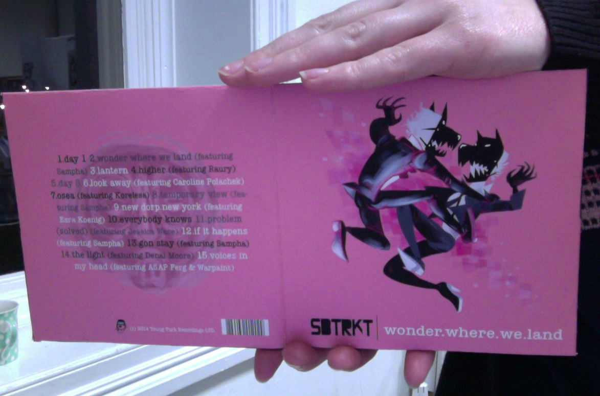
The concept for my non-narrative project was 'traditional masks used as every day wear', which was in reference to my chosen artist, SBTRKT. I wanted to show traditional tribal masks used as casual clothing or props in my work, something which I thought came across evidently in my editorial piece. I also decided to show this in the colours I used in my illustrations, using dark, solid blacks (representing the traditional masks) against soft blues and pinks (representing casual, every day life). 

As a non-narrative project, I really thought it helped me expand my artistic horizons and give me an insight into commercial design and advertisement briefs that could be given to me by potential clients. My digital drawing skills have also grown since I began drawing digitally for the first time last year and at this stage, I believe that digital art is my prefered artistic medium of choice. That being said, I thought that more traditional drawing with various media such as paint or pencil and some sketch book development work with  would have benefited me for this project.

I'm happy with the illustrations I produced, although I would have liked to have added more to my product illustrations. I put a lot of time and thought into my illustrations and I hope that shows in my finished pieces.

I would have liked, however, to have done a lot more written work and blog posts. I concentrated a lot more on my illustration pieces than my written work and in future briefs, I will try to make time for both drawing and written work and I will try put as much time and effort into both.


Conclusion


Overall, I've enjoyed this module and I've worked hard to create illustrations that could actually be used in professional promotional products. I've had little difficulty coming up with ideas for images, only slightly occasionally hitting creative walls. As I said before, I would have liked to have done more written work and I will keep in mind for future projects to do as much research and written work as I can. 

Viennese carnival masks


Viennese carnival masks


Another part of the world that's famous for it's beautiful, stylised masks is Venice.  


Although not as ancient as the African and Aztec masks, the creation of Venetian carnival masks date back to 1162, where a carnival was held in honour of the victory of the 'Serenissima Repubblica' against the Patriarch of Aquileia. Although there's little evidence as to when the first Venetian mask was worn, it's believed that the masks were created as a result of the rigid Italian class hierarchies and the masks aloud rich Italian noblemen and women to mingle with lower class citizens without damaging their reputation.

There are many different types of Viennese carnival masks, such as the columbina mask (which only covered the wearer's eyes, nose and upper cheeks), the volto mask (a stark white, gold gilded decorated mask that covers the whole face) and the medico della pesta, or the 'plague doctor' mask.


Venetian masks are usually made moulded leather, porcelain or even blown glass. The iconic, intricate decals of the masks are hand painted on and are sometimes also decorated with gold leaf, feathers or gem stones.

South American masks


South American masks


Aztec and South American art are a big influence in Hidden Place's mask designs as well as African tribal art.

Similar to African culture, the Aztecs believed that masks had a connection to a spiritual world and were only worn for special rituals. Most Aztec masks, however, were made only as ornaments for display and were made with no eye holes.

Masks were usually made or plated with solid minerals or stones such as green stone, turquoise, black obsidian, polished wood, volcanic glass, gold pyrite, coral or sea shells.

Death masks were made to be worn by royalty and noblemen to wear after their death or to be displayed as ornaments in memory of the deceased.

Sometimes, actual human skulls were used as bases of masks. Below is a human skull plated in turquoise and obsidian, made to represent the Aztec god, Tezcatlipoca.

Aztec skull mask - British Museum

African tribal masks


African tribal masks


African inspired tribal masks are a big part of both SBTRKT's and Hidden Place's identity as an artist. Hidden Place has stated that Aztec and South American art is one of the influences of the designs for their masks but the main influence and over all reference in appearance would definitely be traditional African tribal masks.

In African tribal culture, masks were and still are used for special rituals and ceremonies and they would represent the spirits of ancestors or animals. Masks that would represent dead ancestors would be shaped like a human skull.

They would usually be made from wood, copper, fabric, pottery, or bronze with details such as animal teeth, hair, bones, straw, feathers or even egg shells.

In African culture, masks were only used for special ceremonies such as weddings, funerals and initiation rites of passage and would usually be worn be dancers would would then become the 'bearers' of the spirit of the mask, depending on what the mask represented.

Some masks be designed to show emotions or personalities, such as 'calmness' with the eyes half shut or 'wisdom', which would be represented with a large forehead and wide eyes (shown in the masks below).

Wooden African Mask

Mask makers are ranked very highly in African tribes because they are believed to be in contact with a spirit world, channeling the faces of dead relatives or ancient beings through the designs of the masks they make.

Monday 3 November 2014

Finished album cover


Finished album cover


For my finished cd album cover, I created my own paper cut-out cd template with a repeat pattern inside design.

Inside design

Instead of leaving the inside of my folded matt paper cd cover blank, I used a repeat pattern of the tribal masks that I drew in my idea development stages. I reverted their colours to grayscale to keep to the pink/black/gray of the album cover palette.


Back/Track list

For the track list text, I placed a block of text with the album track list over a larger, faded version of one of my tribal masks. I made each track title either black, white or gray to differentiate from each track and to keep to the theme of the colour palette.


Finished album cover/double inside/back cover template:


Finished (printed and constructed) album cover:


Product design: Festival masks!


Product design: Festival masks


For my product, I designed a pair of paper masks that would be given out at festivals and live performances. I went with an 'Alice in Wonderland' theme for my masks because SBTRKT's album title, 'Wonder were we land' sounded like a play on the word 'wonderland' to me.

My two masks are based on the two characters, The Cheshire Cat and The Queen of Hearts. I drew both of them digitally.


Cheshire Cat mask


The first mask, The Cheshire Cat, was designed with a South American/Aztec influence in mind.


I chose to use a bright, warm colour palette and solid, geometric shapes for this mask in reference to the warm colours and shapes used in South American art.


I added no shading to the mask and only coloured with a flat paint texture brush and chalk brush to make the mask look slightly like a painted wall mural. 


I used a lot of bright, simple shapes to decorate the mask which made it look a little like a piñata animal to give it a fun, festival look.


Queen of Hearts mask


For my Queen of Hearts mask, I chose to give it the appearance of a Viennese carnival mask, something which I thought would fit in a festival environment but also have a regal, royal look representing the character of the queen of hearts.

I was originally going to make the base colour of the mask a powder blue colour to contrast the red/yellow colours of the cheshire cat mask but I decided against it after I thought pink and red suited the character better.


I used a speckle brush and a white charcoal brush to high light the mask while adding dark pink shading around the eyes and some of the edges to give the impression of a ceramic mask. I also drew some thin crackle lines on the pink base of the mask to replicate the faint cracks you would see on the white porcelain parts of a Viennese mask.


I drew the finished facial expression of the mask as a sneer instead of a slightly happy neutral expression that you would see on most Viennese masks.

Promotional poster design


Promotional poster design


For my promotional poster, I decided to include two things representing SBTRKT in my image while using a blue colour palette, ranging from very light blues to dark blues.

The two things representing SBTRKT in my image are one of his signature masks and a black panther/cat that looks similar to the one that appears on the cover of the 'Wonder where we land' album.

I started out by digitally painting a grimy, dark texture over the background to give the picture more depth.


I then painted the basic shape of the mask at the bottom of the picture and then I drew the panther over the top, in a lighter grey colour to prevent them from blending into each other.


I used a light turquoise colour on the panther to create a lighting effect.

I added another lighting effect to the image near the bottom/middle of the image using a deep blue colour to simulate a blue light coming from underneath of the mask, also hitting the lower half of the panther. I used a speckling brush on the figure of the panther to give it a slight glittery texture.

I then added SBTRKT's logo at the top of the poster.


(poster without SBTRKT logo):


Two page spread editorial picture


Two page editorial spread picture


For my editorial picture, I decided to draw a two page fashion illustration spread. For my first attempt, I used the same colour palette that I used for my album cover, with a few added colours. 

Here's my unfinished first illustration:


The image I was going for was a club scene with SBTRKT performing live where everyone in the club was wearing tribal animal masks. 


I decided against using this image however since I thought actually using SBTRKT in an image would be contradictory of his anonymity. I also thought that using the same colour palette twice was a little boring and I could come up with a less complicated, cluttered image. Plus, I noticed there would be no space for any text to be placed.

I thought I'd try and simplify my image by drawing only two people instead of a whole crowd while still referencing SBTRKT via tribal masks.

(finished picture):


I coloured the two figures with lighter colours as opposed to the masks that they're wearing to make the masks stand out more than they do. This is supposed to be in reference to SBTRKT's anonymity. I also left enough space for text in this picture, unlike my first illustration. 

I used both an African inspired mask and a Viennese carnival inspired mask in my image to add some diversity.

I also reused one of the masks that I drew as development as a repeated pattern background.


Halloween SCREEM party poster


Halloween SCREEM party poster


This October, our class got together to organise a party that would take place on Halloween. We decided that we needed to advertise in order to spread word of our event and I volunteered to draw up a design for a poster.

I drew up a black and orange background first and sketched a waist up figure of a happy pumpkin, leaving enough space for the text information that would also be on the poster.

I made two different varients of the same image.


Orange varient:


Green varient:


After showing the two different posters to the rest of my class, we decided to use the green varient and we created a Facebook group advertising the party, naming the event 'SCREEM' after a class discussion. 


Green poster with text version:


(text was made by arron shepherd)


Unfortunately, the event didn't go ahead due to lack of ticket sales and lack of planning on our classes part. 


Creating a poster for an event was a fun, interesting task for me to do and i got a lot of good feedback  from the rest of my class regarding my design. So, even though it was disappointing that our event didn't go forward, designing and drawing the poster gave me some experience in creating something for an advertising brief. 

Album cover


Album cover/design

For my album cover, I decided to make my own colour palette to work from since I decided against using the black/neon red like the official 'Wonder where we land' album cover.

Below is the colour palette I used. I also downloaded some digital photoshop brushes to create a sort of solid flat paint and charcoal shading texture in my picture. i didn't want the colours I chose to be too bright but I did want them to stand out against the background colour, that way my final image wouldn't look too out of place against the pink background but it would still catch the viewers attention.

(Here is the colour palette I used):


Below is my finished album cover (without album title text):


Since SBTRKT's music is mainly electro/dance with tribal influence based, the first thing I thought of for a cover image was some kind of club brawl interpreted through wild animals, so I gave the two faceless figures vicious looking animal masks. I also made their hands look claw-like to make them even more animalistic.


Sunday 2 November 2014

Development/Drawing masks


As some early development for my project, I started digitally drawing african tribal masks with bright neon colours and solid blacks inspired by the cover of 'Wonder where we land'.


I started out recreating existing masks and drawing them in chalk/rough pencil photoshop brushes.


I then started to create my own mask designs, still using the same brushes as before.


I also tried drawing animal skulls in the same way I drew and coloured the masks. I drew animal skulls since Hidden Place stated that they take inspiration from animals when they design and make their masks.

- hedgehog skull


-badger skull


-squirrel monkey skull


-elephant skull


Unfortunately, the bright neon colours I wanted to use where too similar to SBTRKT's promotional images and album cover so I decided against using them in my other pieces.

Hidden Place


Hidden Place


'Hidden Place' is SBTRKT's official art director and is the creator and designer of SBTRKT's many different tribal inspired masks. Taking influence from ancient Aztec and South American art and also the masks of The Dogon people, Hidden Place makes 'modern versions' ceremonial masks merdged together from their various tribal inspirations for SBTRKT's live performances. SBTRKT gives Hidden Place free reign with the designs of the masks


SBTRKT Mask

For a performance at Bestival, Hidden Place designed over 2000 paper masks for festival goers (pictured below)


Hidden Place's twitter page -  https://twitter.com/AHIDDENPLACE
Interview with Hidden Place - http://www.okayafrica.com/news/a-hidden-place-behind-sbtrkts-masks/

Chosen artist/album


Chosen artist/album


The album/artist I've chosen for this brief is 'SBTRKT' and his album 'Wonder where we land'.


SBTRKT with his signature mask designed by artist 'Hidden Place'

SBTRKT is actually an indie-pop/electronic/dance music project first created by DJ, Aaron Jerome in 2009, In order for the general public to concentrate on the music that Aaron creates rather than himself as a person, he prefers to use his own project's name and wears tribal inspired masks when performing in public.

His first self-titled album, 'SBTRKT', was released in 2011. His most recent album, 'Wonder where we land' was released this year in October. 'Wonder where we land' is mixture of solo songs and  songs featuring various other musicians including SBTRKT's long time collaborator, Sampha.


Interview with SBTRKT - http://www.fabriclondon.com/blog/view/introduce-yourself-sbtrkt